Saturday, 22 October 2011

Montage-it Workshop 3 Final Submission

Final Submission:
The process of montaging was an invaluable one which taught me techniques which involved coming up with concepts and also developing them through a series of montages.

The concepts which I had interpreted from Eduardo Chillada's artwork 'Aldikatu II' I felt were successfully represented in the final montages.

The concepts which I developed on were
  • light and dark
  • interior and exterior spaces
  • juxtaposition of ideas


- Montages:
Atmospheric Montage

Site Montage

Attention to detail was essential in creating realistic images of hypothetical spaces. By playing with light and shadow and realistic textures, offset by chimerical colours, my montages exhibited a fantastical but believable interpretation of how my model could occupy a space.

- Flipbook:

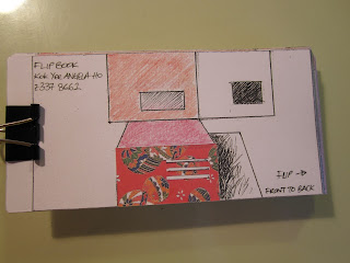
The flipbook I felt was a quick and simple tool for communicating the conversation between the internal spaces and external spaces. As you flick through each shot, the continuity helps to guide you smoothly through the model and creates an illusion that you are actually going through a realistic space. This sense of connection between the flipbook and the observer works on different layers and levels as this is the experience which a visitor would have with the building. 

I arranged the edges of the cards at an angle to enable the flipbook to be flipped at ease.


Montage-it Poster:

The use of different mediums such as a 3D model, of different site contexts places emphasis on different aspects of architectural ideas. My poster juxtaposes the raw original states of my concept model, blank without context or scale, with the finished montage which playfully and realistically shows the inter-relationship between the building and the environment.

Friday, 21 October 2011

Montage-it Workshop 3 Week 3

Reworked Montages:
- Atmospheric:


 Using an existing atmospheric image, I reworked it to my needs. I emphasised the colours in the sky which I felt would be effective in juxtaposing with the monotone colour of my model. By using a rainbow palette, I further accentuated the whimsical and fantastical aspects of this environment.

I chose to use an internal shot to pronounce the vast dimension of the internal spaces. The external space is heavilly accented by the extreme extended shot of the mountanous terrain.

The final product:
I converted the ceiling and right wall into glass and created a reflective effect to add realism. Also, the addition of  shadows add a realistic element and depth to the picture. I chose a stony texture for the left wall and floor, complimenting the ancient and  archaic mountain seen through the glass in the distance.
I also used furniture in the internal shot to help convey the fact that it was a living space. 
The individual elements such as the added texture in the walls and furniture helps to convey an extremely atmospheric picture.

- Site Montage:

Following the park site shot from the previous week, I felt that the final shot works extremely well in integrating the model in a realistic manner, through the use of shadows of the building on the ground and also the shadows of tree branches on the model.
Perhaps a human scale would have provided the picture with more context, however, I felt that leaving the montage uncluttered better conveyed the subtle but jarring juxtaposition between the artificial feel of a human manufactured  model and the natural context of the park with its organic colours.

Flipbook:

I reworked and improved on the previous attempt at constructing a flipbook through adding colour to increase continuity through the flipbook. 

Colour and pattern also acts as a motif throughout the flipbook:

The oragami paper acts as a lead, luring the eye in with the various use of colours (red, orange, yellow, blue, green) leading the observer through the journey into the model.

The layering of information on the flipbook acts both on a physical level and a conceptual level. The use of the oragami paper alludes to the flipbook being 'paper' art.


Sunday, 9 October 2011

Montage-it Workshop 3 Week 2

Atmospheric Montages:


I attempted to use atmospheric photos which I had taken myself to montage my model onto. However, through experimentation of using different scales and different environmental contexts, I learnt that a different approach and picture would better convey my concepts of opposites and 'external vs internal' spaces.

Site Montage:


I took pictures of a nearby park and montaged my model onto it. This did not lead to a very polished result, so I realise perhaps a cleaner park and more layering would produce a more realistic shot. However, I am pleased with the position of the model; it is in line with a pathway which adds the realistic context that the building is approachable and used everyday in a normal context. 

Flipbook: (a journey through the model)


Using a series of 15 shots to illustrate a journey through the model was difficult as every frame required a slightly different perspective yet had to be related to both the shot immediately before and after it. Even though the task was challenging I feel that at this stage I have accomplished a working flipbook which is continuous and which will work well upon more layering and use of colour.

A problem I recognised is the lack of a distinct reference point from one slide to the other as the drawings are in black and white.

Sunday, 2 October 2011

Montage-it Workshop 3 Week 1

Montage-it Introduction:
This workshop is less related to the first two workshops, but is equally as important and its process equally and invaluable in learning different types of communications. The lesson learnt in this module is less to do with the representing techniques for architectural concepts and more to do with developing and reinventing the concept itself, an important lesson and idea which the first two workshops introduced to me about. 

Using Eduardo Chillada's artwork 'Aldikatu II' I imagined and developed the following concepts:
  • light and dark
  • use of angles
  • interior and exterior spaces
  • juxtaposition of ideas
  • conversation (relationship) between ideas


Aldikatu II

Construction of a concept model:
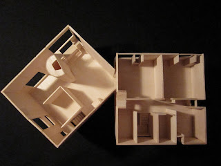
Using the keywords (above) I constructed a concept model out of balsa wood.


I constructed the model with the use of different angles in mind. The lightness in the colour of balsa juxtaposes against the dark shadows which the different angles cast and compliment the grain of the wood.
The slits and openings questions the definition of internal and external spaces.

Sunday, 25 September 2011

Draw-it Workshop 2 Final Submission

Final Submission:
I chose to construct my final submission with two drawings on two A2 sized papers.


 My decision to use the first floor plan and the axonometric drawing was to show that drawing is a process which can represent buildings and architectural spaces in a series of separate yet connected ways. The concepts which I wished to stress in my final submission were the relationship between the building and the light, and also the building as a living area and real object.

Playing with light and the spaces in the building was featured in the first floor plan. I aimed to celebrate the ability which drawings have in exemplifying certain elements in a building such as the curved, organic lines and also the drawing techniques' effect of adding a soft and earthy element to the representation, along with whimsical splashes of colour. 

The decision to use the the axonometric drawing and positioning it beneath the ground floor plan was to illustrate the relationship which the two drawings have. Even though the two drawings individually aim to emphasise two different points, their inter-relationship is inevitable; as are the ideas in the real-life Rose Seidler house. 
The walls in the axonometric drawings allude to the plans and thus I highlighted this fact by inking in the tops of the walls. 

The 1950's context of the house and the moderistic (at the time) feel of the house, which is captured in the mural, is represented in the submission. I felt that this was necessary in illustrating my interpretation to what this module was teaching us: to use pens and pencils beyond what is seen. 


Draw-it Poster:

The use of the pictures depicting a working drawing environment shows the technique of drafting and representing architectural concepts though pen and paper is a long and layering process. My poster emphasises the detail of every pen stroke expecially in the rendering techniques, which ties a whole picture together in physical appearance and in ideas. In the Rose Seidler House, the mural encompasses the spirit of the house being from the 1950's and thus the allusion to the 1950's used in the final submission shows that context of a house is as much part of the house as the materials from which is has been built from.

Thursday, 22 September 2011

Draw-it Workshop 2 Week 3

Axonometric Drawing:
Constructing the axonometric drawing allowed me to piece together the different elements of the building - the elevation, plan and section, together, furthering my understanding of the Rose Seidler house (introduced to me only 2 weeks ago). This drawing allows to you to imagine the building in a three-dimensional space, and thus I felt that this was an effective way of representing the building. The drawing itself was tricky to construct due to the adjustments needed to draft the facade and also the added information in the height of the interior walls. I took as much precision as I had taken in constructing the original plans and elevations, as I intended the axonometric drawing to provide as much information as the other drawings had. 

Wednesday, 7 September 2011

Draw-it Workshop 2 Week 2

This workshop, in some ways, proves to be much more challenging than the 'Model-it' Workshop as it requires more precision and a developed concept and goal inside your mind before a final product is turned out. The 'Model-it' workshop did introduce these aspects of architectural communication and now this workshop - draw-it, allows me to further my understanding in representing architectural ideas.

Elevations and Section:
This week's in-class task and take home exercise of drafting and completing the elevations and section of the Rose Seidler house was similar in experience to drafting the plans. It furthered my understanding in the house itself, where the windows and openings in the house was positioned. Most of all it was a process which helped me improve my inking techniques and thus as I drafted the elevations and the section, the task became easier and quicker.

Rendering Introduction:
The study into rendering techniques to add texture and illustrate the architectural concepts was an invaluable process which taught me the effectiveness of rendering in increasing the appeal architectural drawings.


Experimentation with the use of pens and pencils allowed me to put my understanding in different forms of architectural communication in action. 

The rendering on the elevation allowed me to test different forms of rendering techniques and their effectiveness in adding texture in the building. Adding texture into the drawing resulted in a conversation between the precise measurements in a 1:200 scaled representation and its environment being established. We are able to see the building in a more realistic context as the building's use of different types of materials and a grounding of the building onto a site (not just a floating object) is established.

The exploration of light and its effect through the building, detailed by the use of graphic pens allowed me to show the building as a living environment where the relationship between the spaces and light is very real.


Sunday, 4 September 2011

Draw-it Workshop 2 Week 1

Draw-it Workshop:
This workshop, on first impressions, seems to be very straightforward; a simple series of 4 weeks to introduce and improve our drawing techniques and how to represent architectural buildings and ideas through reproduction of the drawings with our hands.

In-class Tasks:
Using the simple house model constructed in the 'Model-it' workshop, we learnt to represent a building through a series of drawings. This simple exercise allowed me to see the relationship between representing a building through a precise manner and representing through a more artistic approach which can help convey different ideas and concepts encompassed by the building.


Take home Task:
After the in-class introduction into drawing plans and elevations, reproducing the Rose Seidler House was somewhat more approachable. However, becoming accustomed to the level of precision and drafting the plans in scale proved challenging.

Drafting the plans was a process which allowed me to learn the techniques involved in using an architect's tools - that is your own hands and the graphic pens and pencils. 

I was pleased with my results, and have learned to represent the different elements in a house such as the walls and windows though the use of different thicknesses in pen lines.

My main tools were: 4H pencils for sketching, and a combination of 0.05mm and 0.1mm thickness graphic pens. 


Wednesday, 17 August 2011

MODEL IT WORKSHOP FINAL PRODUCTS WEEK 4


On finishing the models we have all learnt a valuable lesson on the importance of communication in architecture as well as different ways of representing and viewing a structure.

The process of building the models over a three week period has helped develop my techniques and skills both in the physical sense of constructing a model and also in an intellectual sense where I now understand the concepts which a model can represent.

In the past 3 weeks of modelling i have learnt about the positive and negative spaces in constructing the in-class models and also the importance of context in the 1:200 Fisher House Site model.

Final Models:

- In-class Models:
Week 1 Model

Week 2 Model 1

Week 2 Model 2

Week 3 Model 3

Week 3 Window Seat Model (1:50)

- Take home Tasks:

Week 1 Barcelona Pavillion Model (1:200)

Week 2 Fisher House Site Model (1:200)

Week 3 Fisher House Basement (1:50)

  
Week 3 Fisher House Ground Floor (1:50)

Week 3 Fisher House Second Floor (1:50)

Model-it Poster:

The use of the angles seen in the Fisher House is highlighted in the poster
My learning experience throughout this workshop was the reworking and reinterpretation of a building which results in architectural concepts being drawn from the model. However, even though architectural concepts can be drawn from the building, through analysis from the model representation, concepts such as the relationship between a building and its environment can be redeveloped.
Thus construction (of the model) and reconstruction (on the concepts) leads to a reimagination.


MODEL IT WORKSHOP WEEK 3

In-class task:

We were asked to build a corner of the Norman Fisher House at a 1:50 scale, a different scale to the previous two take home excercise. Thus another level of detail and complexity we must bring to the model was increased allowing me to rethink my approach to building the corner


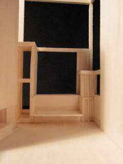
the window seat of Fisher house was constructed using the plans and elevations as a template. The windows and openings could be further examined through research and image searches. 
I felt that the model of the corner was constructed well as the seats and window boxes were constructed true to the building itself. Some detail on the boarding was constructed, however I felt that more detail could have been attempted.

Take Home Task:
- Window Seat:
I approached the Fisher House ( at the scale of 1:50) in a similar style as was undertaken when I constructed the window seat.

Using plans and elevations which have been scaled to 1:50 the facade, exterior and interior walls were constructed 

- Construction of the Fireplace:
again the top and bottom of the fireplace was cut out using the floor plan as a template


Similar to the construction of the window seat, i felt that the level of detail should be placed on the internal elements of the house to highlight the fact that it was a living space

- Ground Floor:
(Ground Floor Plan)

Some continuity of the extent to which details and precision was included in the models was undertaken. As with the window seat which the frames and boarding pattern was taken into account, the direction of floorboards was represented by constructing the floor in a series of balsa pieces. The nature of the balsa wood was exploited as I utilised the physical appearance of the grain pattern in the model.

- Basement
The Fisher House is known for the simplicity of its depiction of two boxes joined together at a corner and thus I attempted to join the walls at the corner in an equally smooth and simple way. 

(basement)

(basement)

(Stairs)

Details which I wished to represent in my model was in the internal elements. Here, the stairs were constructed in detail to a high degree to highlight the fact that the house was built for living purposes. The combination of walls and stairs also represent the flow of people throughout the houses and thus the model can be used to study the way visitors connect with the house.

-Further Details:

The slit at the main entrance of the Fisher House was represented by cuttinf the balsa wood straight and at an angle. 

The effect of this can be seen physically by positioning the light in front of the slit, mirroring the Fisher Houses playfullness and connection with nature.

Final Product:

Basement

Ground Floor

Second Floor

Ceiling